Ultimo Pacto
A Christian Ministry Blog-Site.
Overview
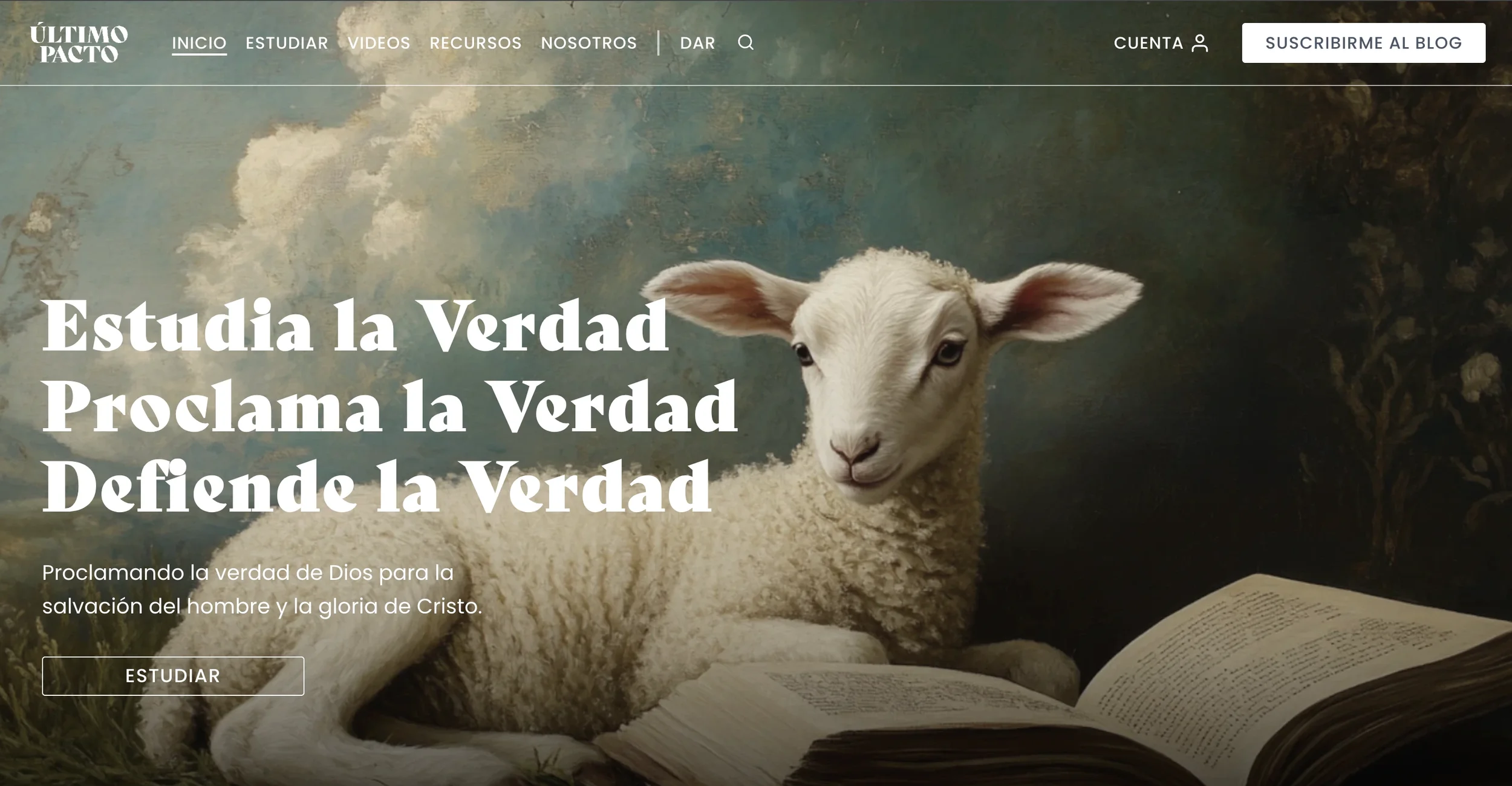
Último Pacto (Last Covenant) is a virtual Christian ministry based in Puerto Rico focused on proclaiming and defending the biblical gospel of Jesus Christ. The visual identity uses a moody soft blue and pastel cream palette to communicate wisdom, sobriety, and thoughtful seriousness, creating a dignified digital presence for ministry and editorial content.
Goals
Create a scalable blog with a clear, maintainable content hierarchy.
Design and deliver the full website (institutional pages, resources, blog templates, contact).
Establish clear reading and navigation flows that prioritize the gospel message and accessibility.
Prepare the platform for editorial growth using categories, taxonomies, and reusable templates.
Scope
Duration: 8 months — May 2024 to January 2025.
Roles
Web Designer: page architecture, visual system and UI, responsive layouts, image/asset optimization.
UX Designer: user research and discovery, content mapping, wireframes, interactive prototypes in Figma, usability testing, and accessibility guidance.
Copywriter: define institutional voice, write headlines and microcopy (CTAs, templates), create blog post templates and a content-style guide with basic SEO considerations.
Tools
Figma — design & prototyping. Notion — documentation, roadmap, and content planning. WordPress — CMS and implementation platform. Pen & paper — early sketches and ideation.
Exploration & Discovery
Below I document the research activities I ran at the start of the Último Pacto project. For each method I explain why I chose it, what I discovered, and how it shaped the following steps.
General
Why
With the ministry led by a single person primarily (myself) with future contributors, I needed a fast alignment session to capture my priorities, limits (time and capacity), and theological constraints so the product would be maintainable and easily scalable by one operator.
What I found
I prioritized clear answers to common faith questions, theological fidelity, and low-maintenance publishing workflows. I wanted tools that made it simple for one person to publish, categorize, and surface content for both seekers and believers.
How it influenced the work
I translated those priorities into a lean scope: single-author editorial workflows, minimal designer overhead, and template-driven posts that reduce manual work. This pushed me to favor reusable components, lightweight CMS admin patterns, and a taxonomy structure that can be managed by one person without frequent developer help.

Analyzed Competitor: GotQuestions Ministries

Competitive analysis
Why
GotQuestions is a leading Q&A-based ministry site that closely matches Último Pacto’s content goals, making it ideal for benchmarking structure and discoverability. We analyzed it to identify scalable patterns that a single author could replicate without an editorial team.
What I found
The site’s concise, SEO-optimized answers and consistent scripture use drive visibility and trust, but its dense taxonomy and editorial complexity hinder scalability. It also lacks strong author presence and print/export options, limiting its use for teachers and preachers.
How it influenced the work
We kept the SEO-focused, scripture-centered structure but designed two content templates—Q&A and study—to serve both readers and teachers. We simplified the taxonomy, enforced metadata, and added print/export features to make the site efficient for a solo creator.
Personas
Why
To design navigation and templates that truly serve the site’s two-sided audience (the single-author publisher and diverse readers: believers and unbelievers).
What I found
Three key personas emerged: the Lead Author (a single owner) needing fast publishing, bulk editing, and clear templates; Eve, a curious seeker wanting short, approachable answers and “Where do I start?” guidance; and Adam, a church leader who relies on long-form studies, citations, and printable resources.

How it influenced the work
We kept the SEO-focused, scripture-centered structure but designed two content templates—Q&A and study—to serve both readers and teachers. I simplified the taxonomy, enforced metadata, and added print/export features to make the site efficient for a solo creator.
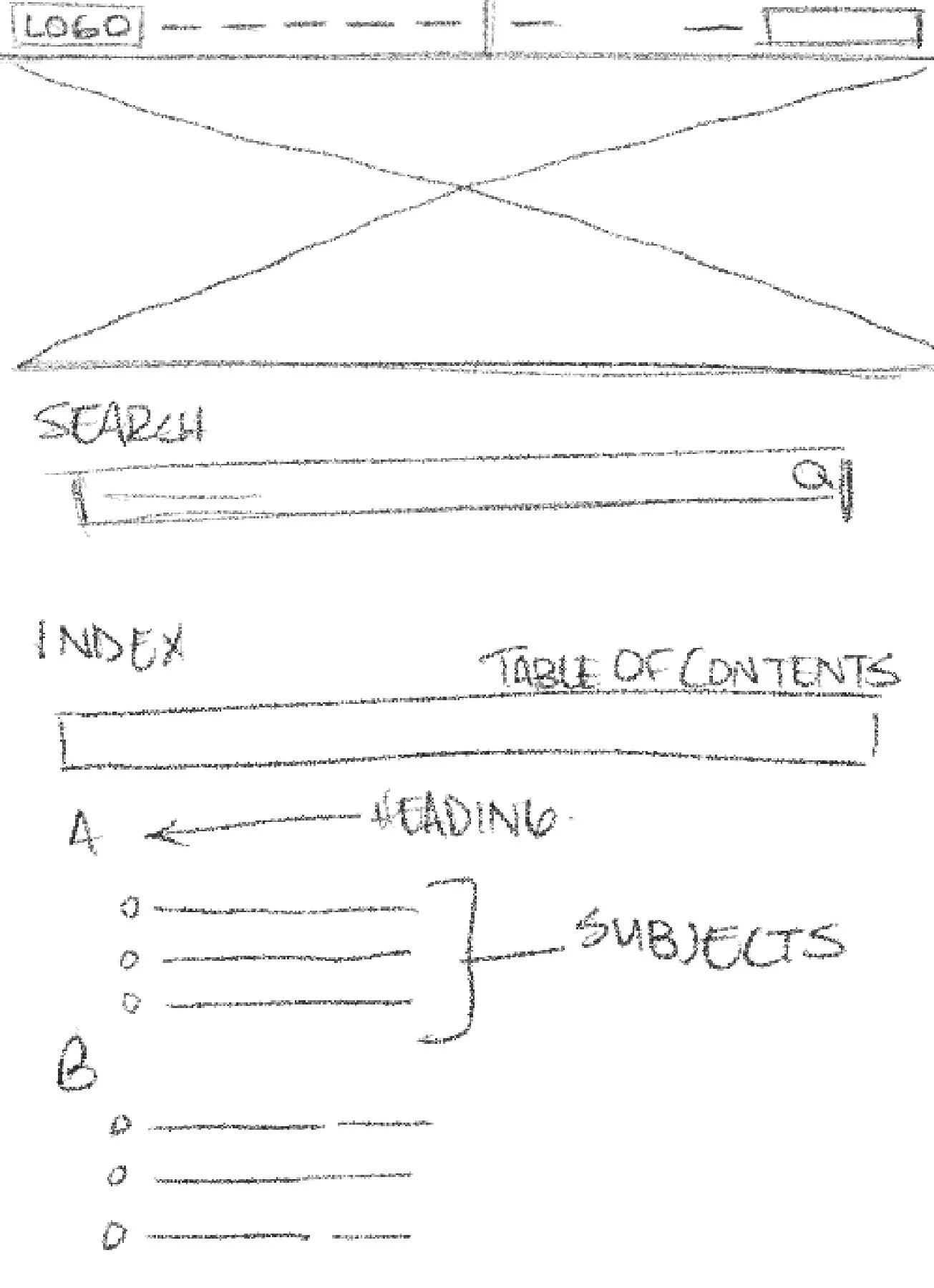
Wireframes
What I wanted to achieve
Quickly test structural options (single-column vs two-column, metadata placement, series landing layouts) without visual noise. Wireframes were used to validate hierarchy, reading rhythm, and interaction placement across breakpoints.
How this contributed to the final design
Wireframes established the site’s structure and layout system, solving scalability with two template families—short Q&A and long-form study. They defined metadata placement, related links, and CTA behavior across devices. Deliverables included low- and mid-fidelity wireframes for homepage, index, topic pages, articles, and the author dashboard.
UX design process

Prototypes
What I wanted to achieve
Turn wireframes into clickable prototypes to test real interactions (navigation, search, filter-by-series, print/export) and to show stakeholders what the live experience would feel like before dev work. Prototypes also served as the single source of truth for front-end implementation.
How this contributed to the final design
Interactive Figma prototypes exposed key UX issues early (e.g., mobile CTA visibility, filter flow). Fixes were re-tested, saving dev time. The prototype enabled annotated handoff screens for WordPress (component specs, responsive rules, accessibility). Deliverables: interactive prototype with annotated components and dev-ready spec page.


